Context

Malt is a European freelancer marketplace connecting 900,000 independents with companies across 10 markets, from one-off projects to full enterprise workforce management.
Malt is a European freelancer marketplace connecting 900,000 independents with companies across 10 markets, from one-off projects to full enterprise workforce management.
The marketplace works on profile quality. The better a freelancer's profile, the more visible they are in search, and the better the matching. But 3 days after registration, less than 60% of new freelancers had a complete enough profile to appear in search at all.
The core tension: collect more profile data without discouraging people from signing up in the first place. Every mandatory field is a potential drop-off. Every optional one is a missed matching signal.
With LLM-based matching, quality of input matters as much as quantity. A detailed job description outweighs three vague skill tags. But it takes more effort to fill in.
Before touching a single screen, I animated workshops with the squad (PM, tech, and ML engineers) to map which fields actually drove matching quality.
There was a concept of both completion and quality: with LLM-based matching, a well-described experience outweighs a list of skill tags. This shaped which fields to push, which to infer.
The original flow had 5 mandatory steps and 7 optional ones. It was unclear to users which mattered and why. We reworked both the field structure and the UI to feel lighter and more inviting, working within design system constraints and with the tech team to keep implementation realistic.
The version we kept significantly reduced the "redundant form" feel of the original, without compromising on data collection. All steps became optional, giving freelancers full control over what they share.
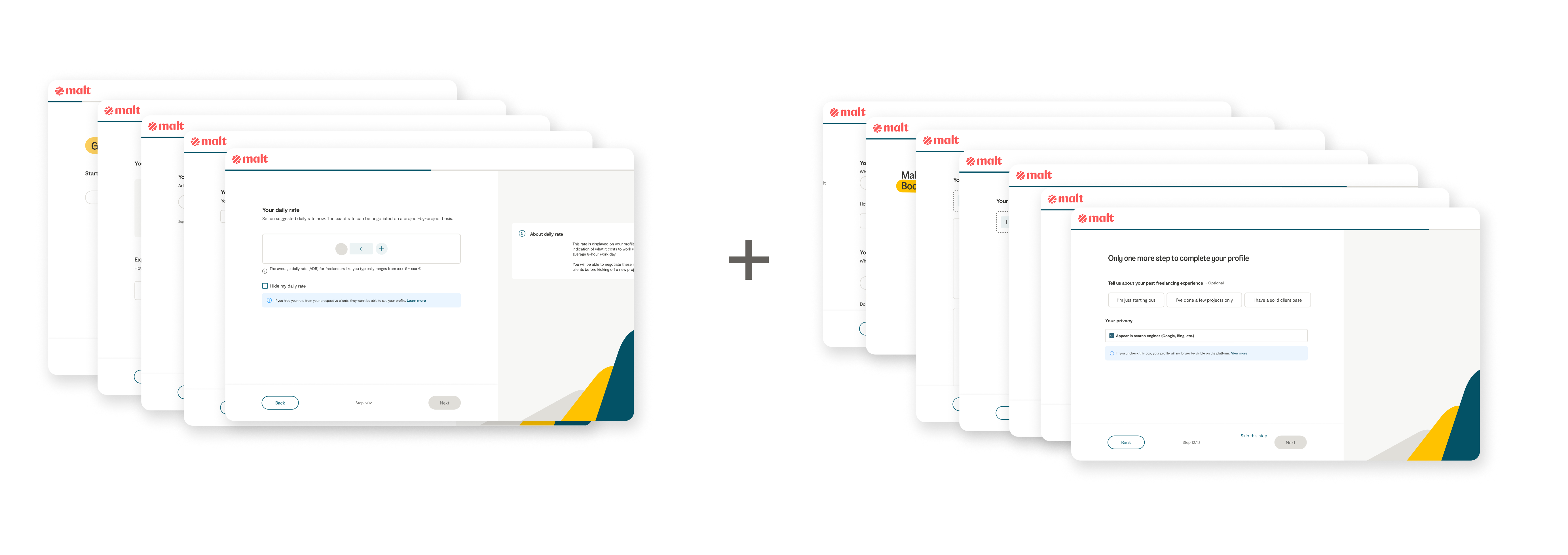
Before : 5 mandatory steps + 7 optional
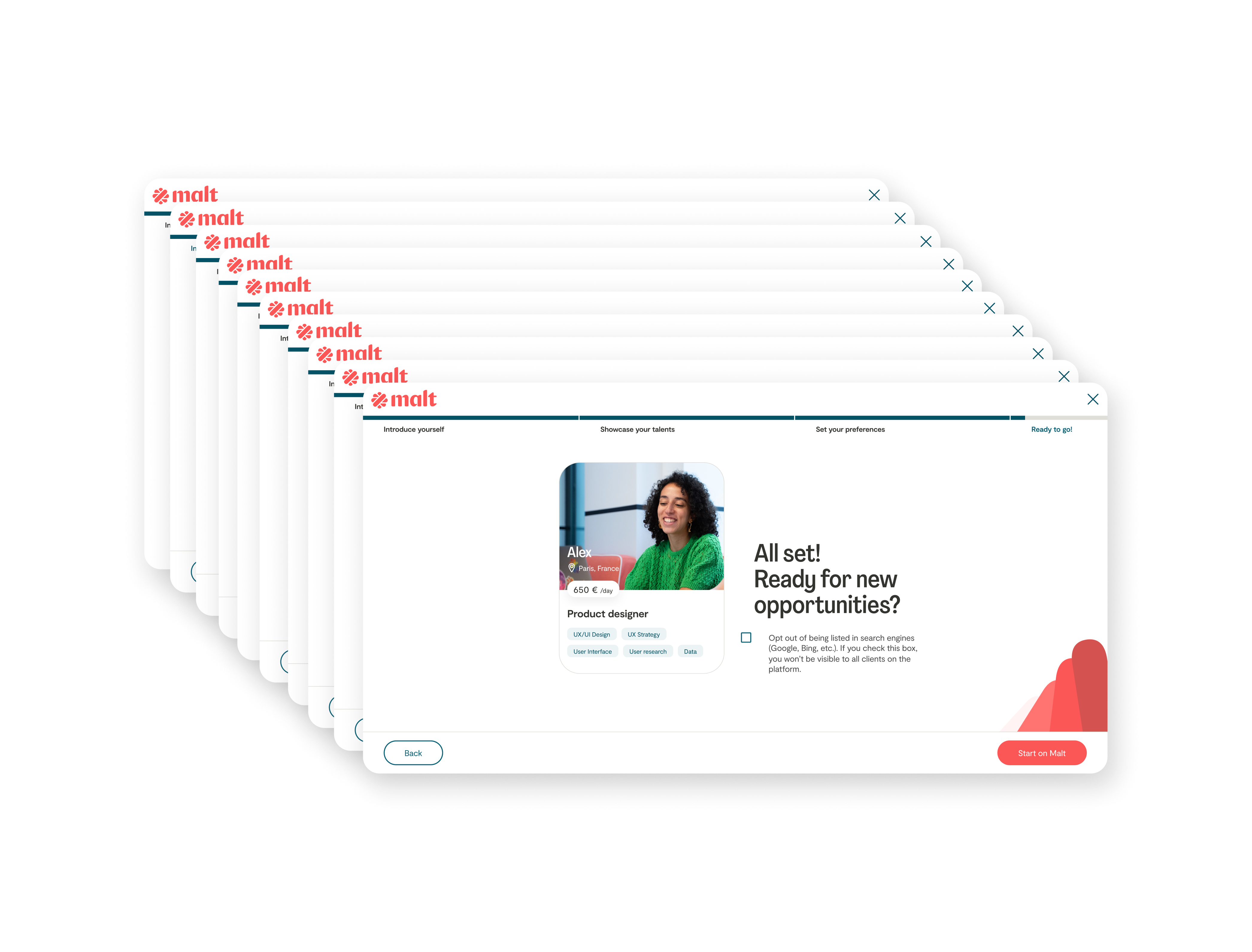
After : 10 optional steps
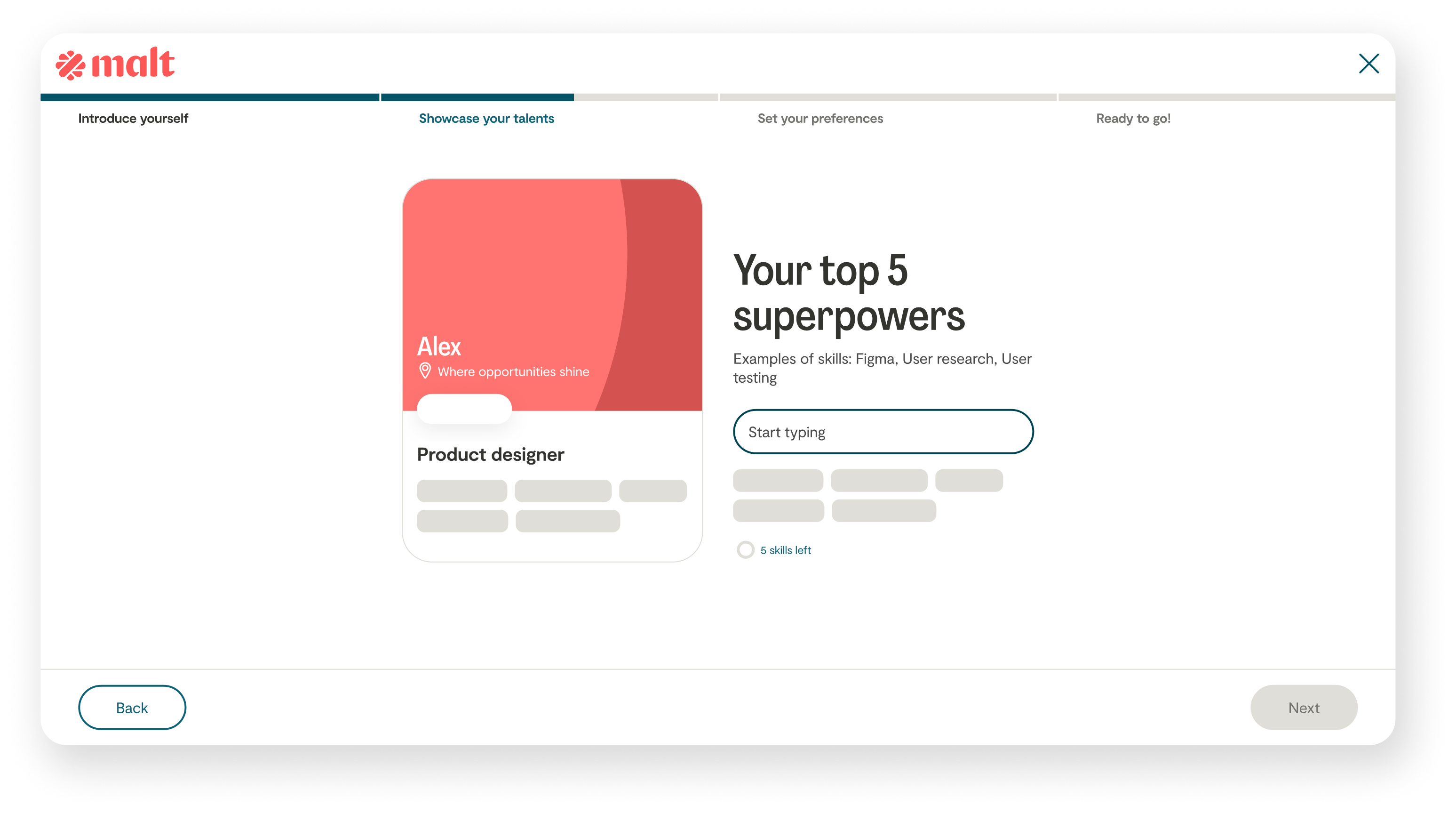
A new bold layout with one input per screen
To alleviate the effort, I worked on micro-interactions that make each step feel like progress rather than meaningless obligation, both across desktop and mobile app experiences.
Card fills as user completes each step
Card fills as user completes each step
Card advances as you progress through the flow on mobile
I recruited freelancers directly in co-working spaces to test early prototypes, rotating facilitation across squad members.
The sessions revealed that copy was the biggest friction point. we'd pushed the tone too far into excitement, and it felt intimidating rather than inviting. We calibrated with the UX Writer to land on the right tone.
The process also surfaced a localization issue: what felt motivating in English could come across as intimidating in French. A reminder that tone isn't just about words, it's about cultural context.
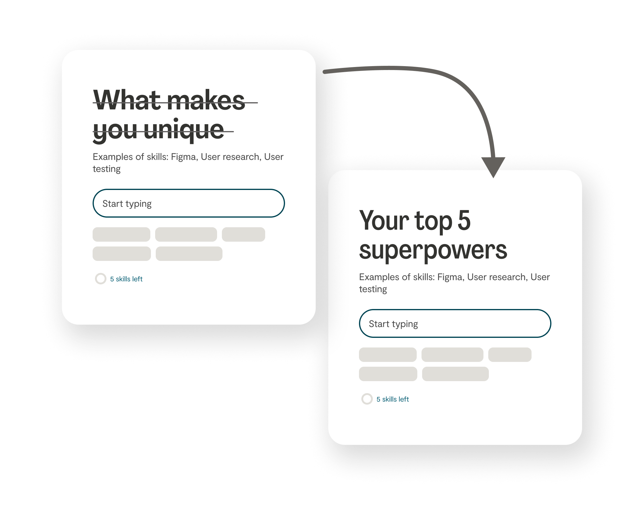
Copy iteration with the UX Writer — from intimidating to motivating
We ran the release as an A/B test and it gave us a clean verdict: 5 points below the tolerated drop of sign up conversion. It is huge.
We went back to the data and rolled up our sleeves again.
The data team had set up the tracking events. My PM and I split the funnel analysis. She owned the conversion metrics, I dug into the behavioural patterns.
Fake recreated Amplitude graph for illustration purposes — data is confidential
High drop on first steps is common. But given that higher-effort steps later in the flow would compound the problem, we needed to improve every point we could. I merged the marketing and sign-up step for a more straight-forward feeling: we gained 4 points on that step.
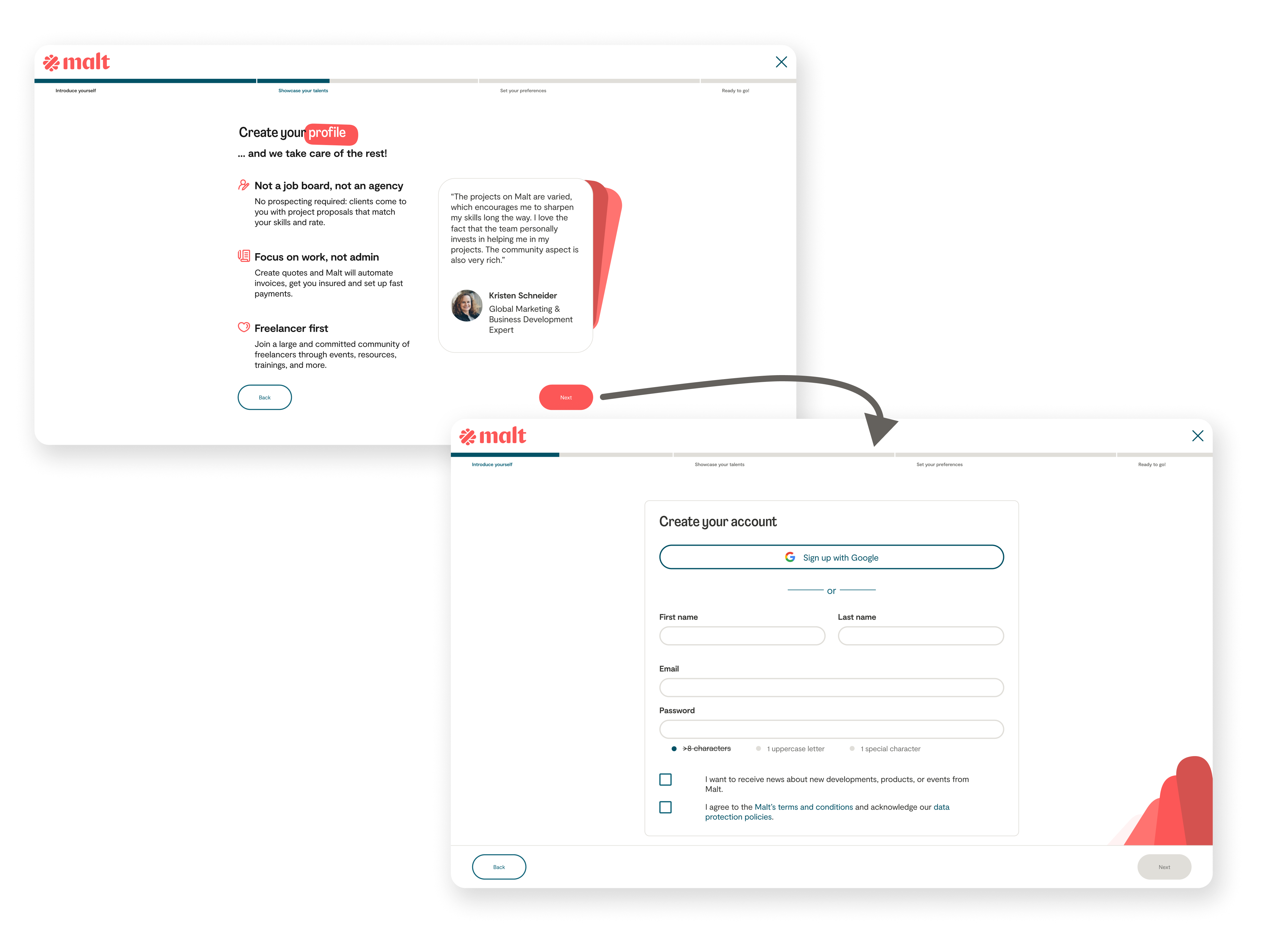
Before : Marketing content and email input on different screens
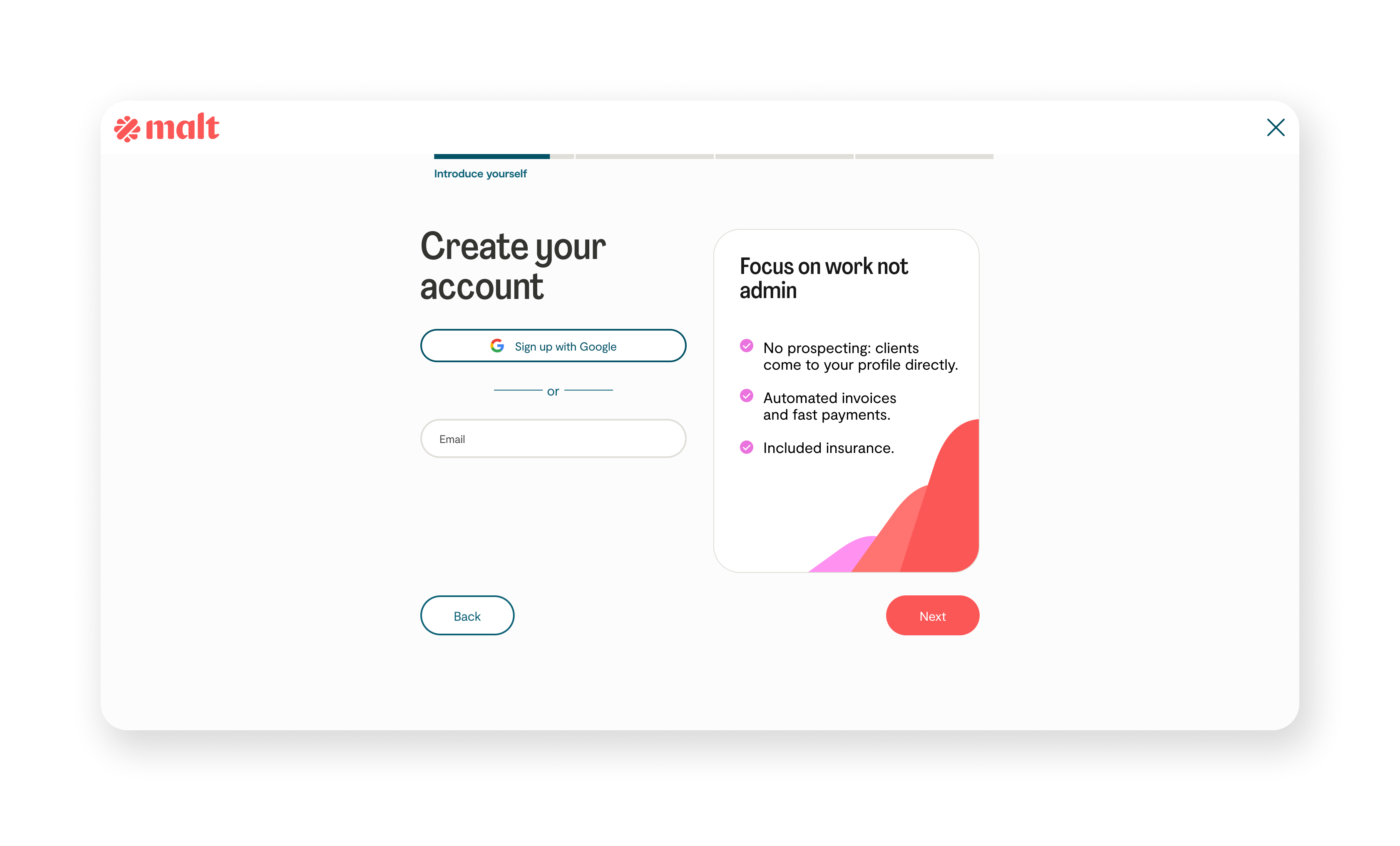
After : merged value proposition on the key decisive email step
To add work experiences, freelancers could either add them manually or upload their LinkedIn CV and let AI take care of the rest. Only 50% had chosen CV upload, and those who went manual ended up with higher drop rates later.
I redesigned the step for better feature discoverability. 80% of users now chose CV upload, up from 50% — more than we'd hoped for. The aha moment landed.
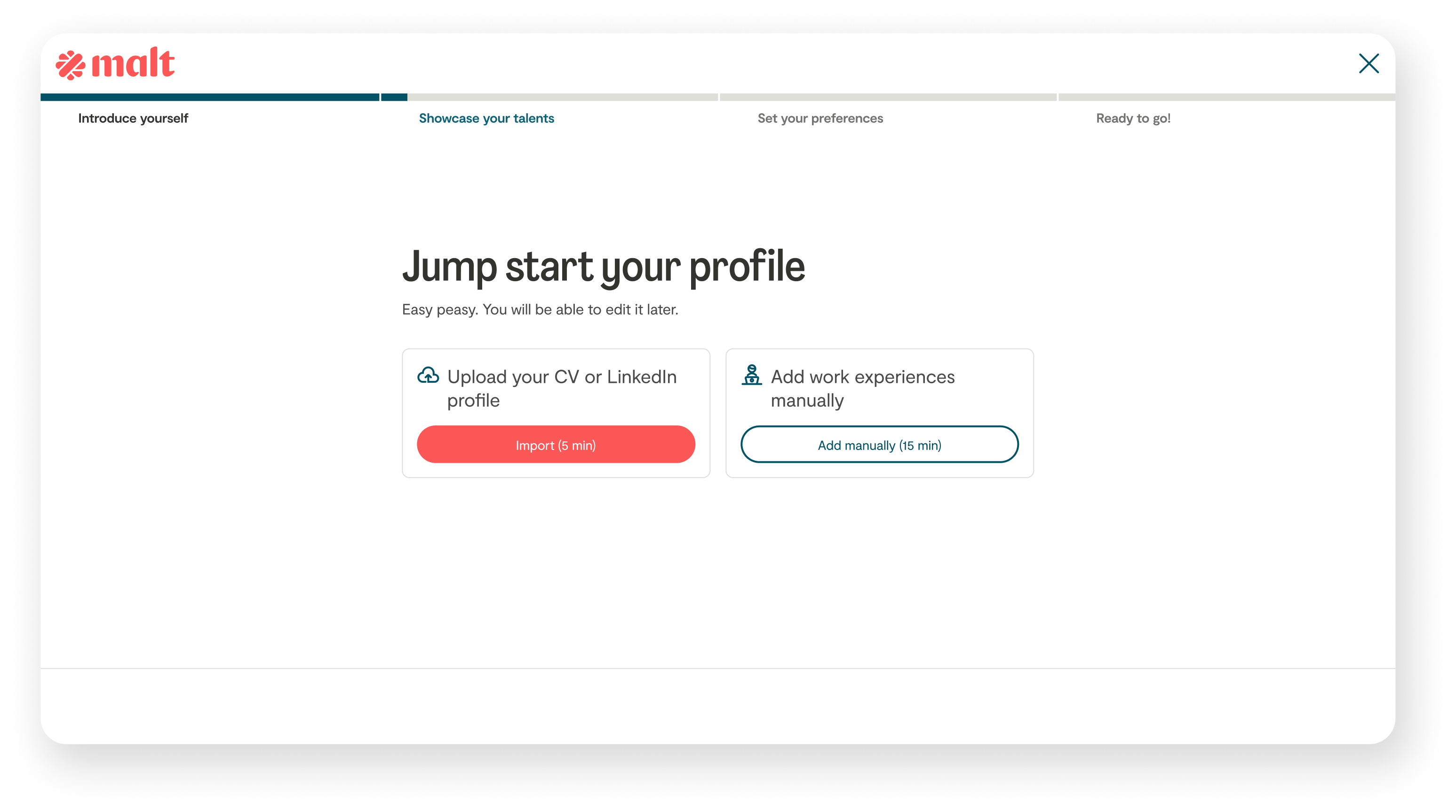
Before : 50/50 split — unclear which path to choose
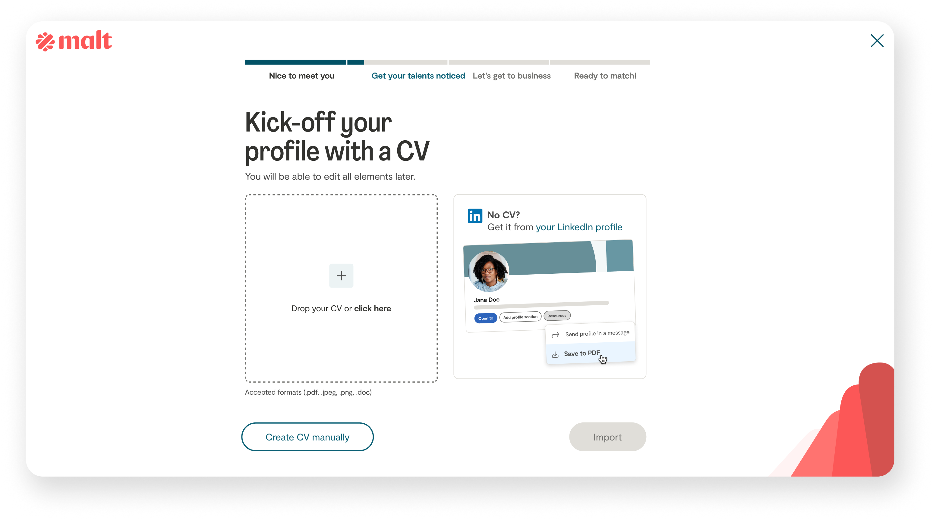
After : CV upload as aha moment — 80% adoption
When freelancers uploaded their CV, the LLM took a few seconds to extract the information. A spinner alone wasn't enough — users were dropping off. We replaced it with a loading state that showed changing words, explaining what was happening in real time. +1.5 points on loading drop-offs.
We measured success against the success metrics and damage control initially set up, and hit them: a controlled drop in sign-up, but more complete profiles after 3 days than before. An iterative test and learn process helped us reach our goal.
We then moved to dashboard and onboarding redesigns, to continue pushing profile completion beyond the sign-up.